Freelance Creative Director
Agency: emc3
Mozilla, founded in 1998 from Netscape's open-source code, advocates for ethical tech, trustworthy AI, and privacy-first products.
Agency emc3 brought me in to elevate their branding proposal for Mozilla's global employee event. We won!
Agency emc3 brought me in to elevate their branding proposal for Mozilla's global employee event. We won!
The existing identity proposal
THE CHALLENGE
While the team was happy with strategy and naming, the design didn't excite them. The agency needed something 'special' for a final pitch push.
THE APPROACH
The existing design was corporate—lacking Mozilla's activist essence. I wanted to create a design that felt current, edgy, full of excitement and playful to resemble Mozillians themselves.
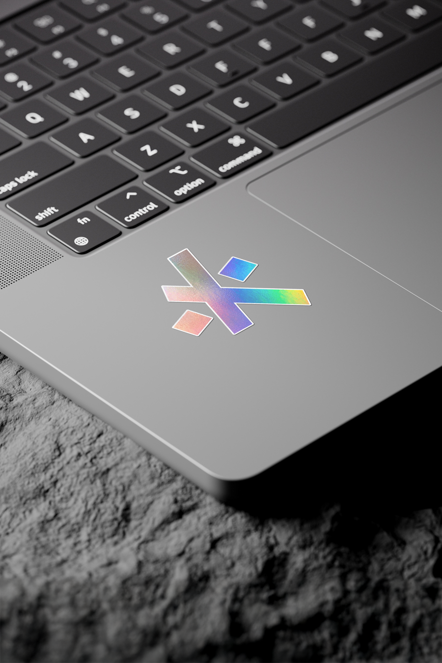
The existing brand mark blended a fox tail with an asterisk. I wasn't keen on this combination, but I loved the asterisk concept—it draws attention and, in programming, means multiplication.
How could I tie the asterisk to Mozilla's brand culture and event goal?
How could I tie the asterisk to Mozilla's brand culture and event goal?
THE IDENTITY:
Mozilla's branding features "://" from HTTP URLs. Placing it beside the asterisk revealed their similarity—both use straight shapes. The deconstruction of the asterisk yields 3 shapes, resembling the ://, which communicates Mozilla's exponential impact on the internet.
Mozilla's branding features "://" from HTTP URLs. Placing it beside the asterisk revealed their similarity—both use straight shapes. The deconstruction of the asterisk yields 3 shapes, resembling the ://, which communicates Mozilla's exponential impact on the internet.
The making of the proposed identity
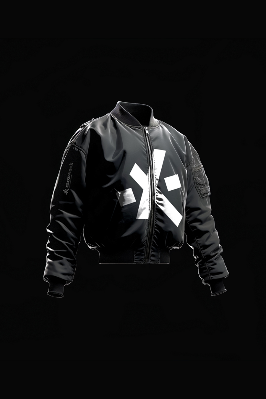
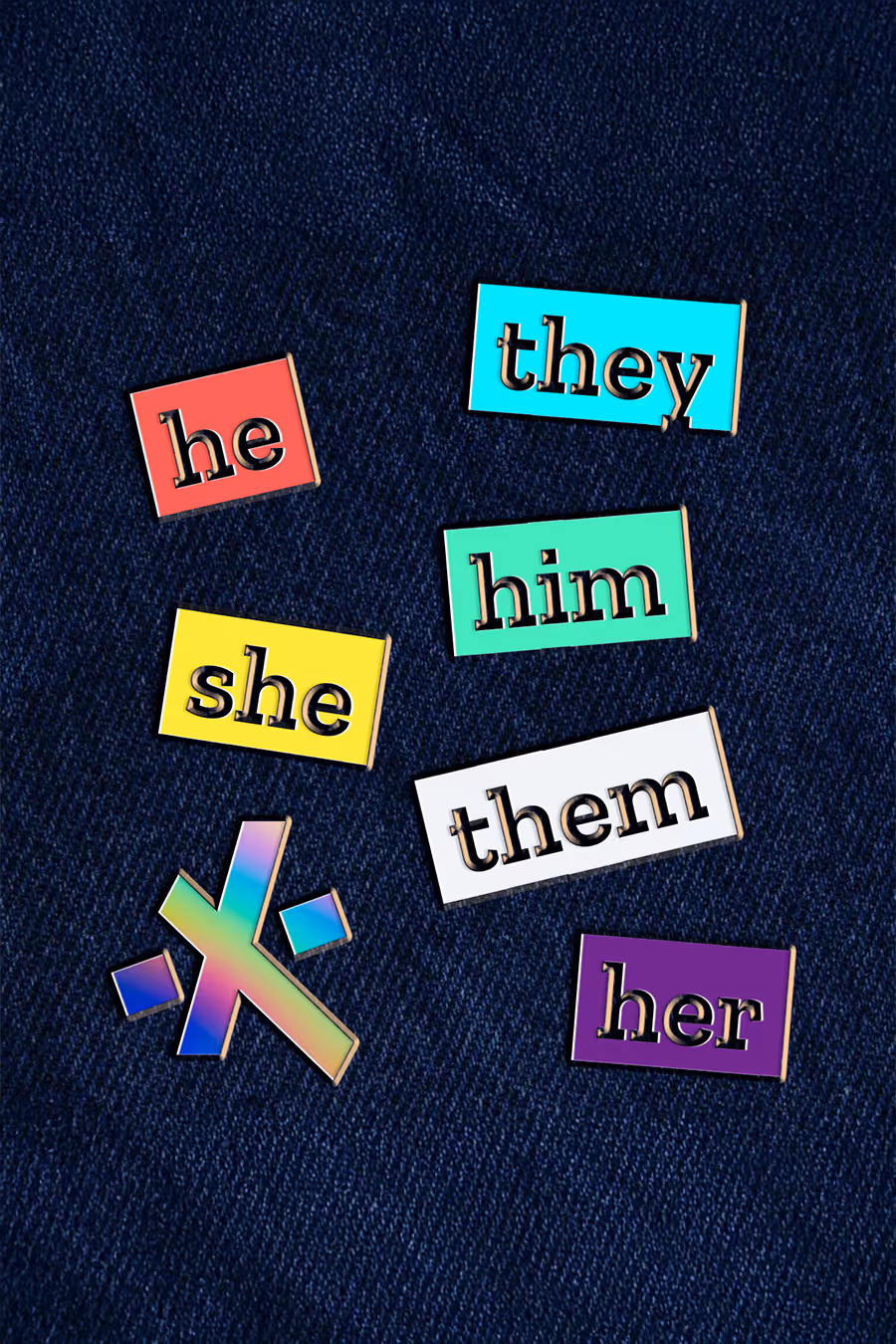

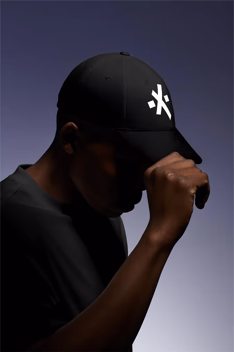
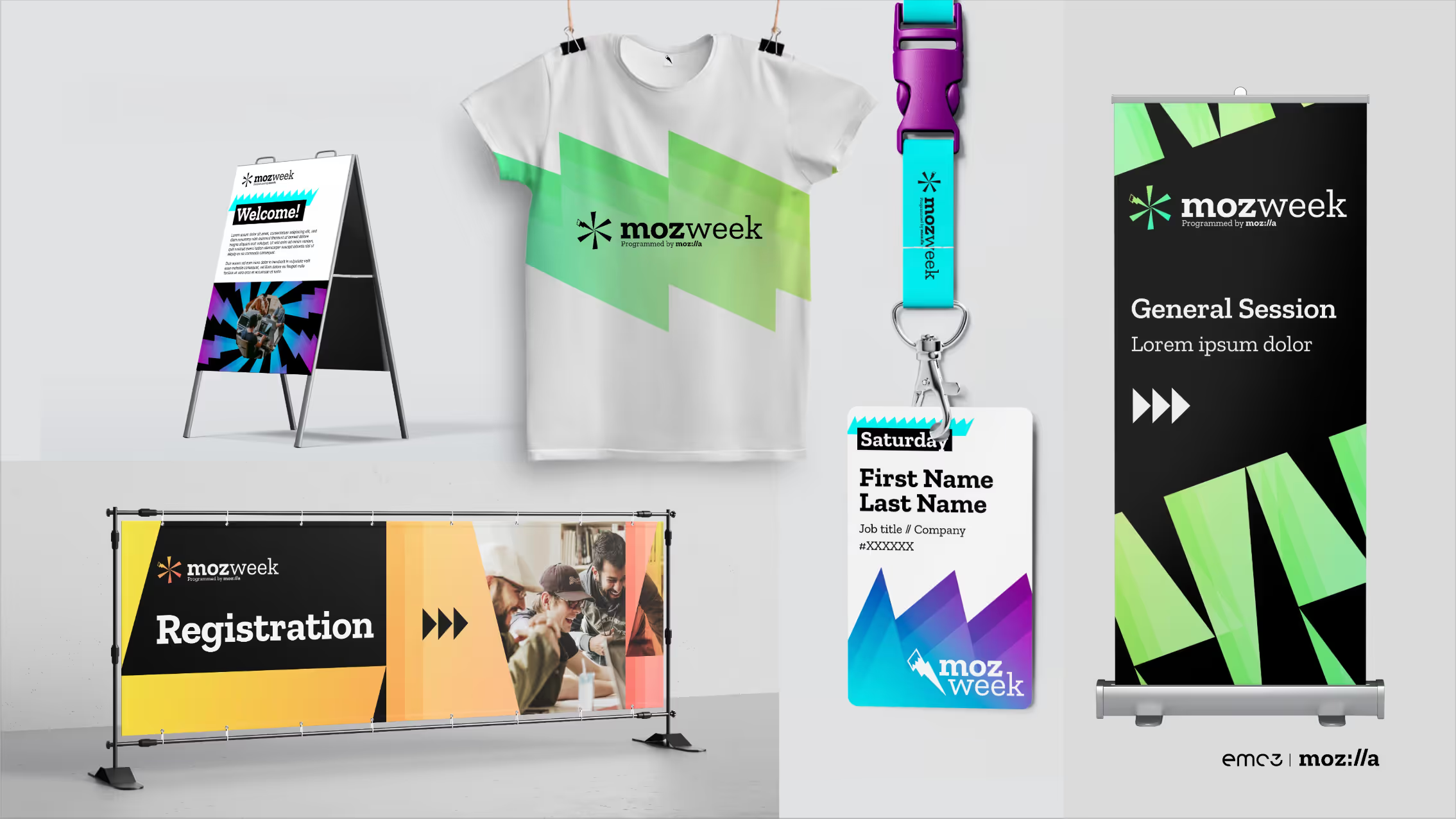
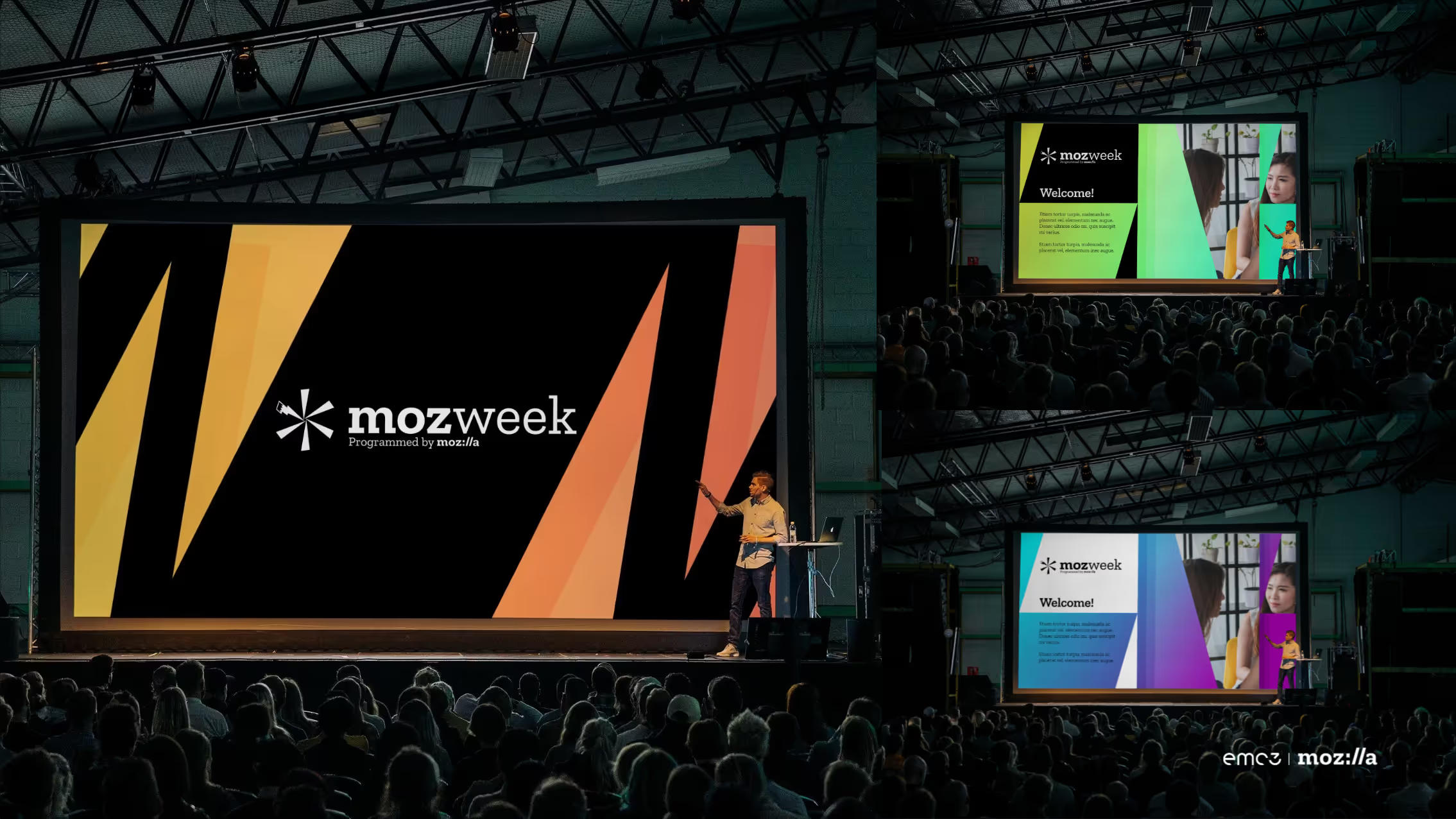
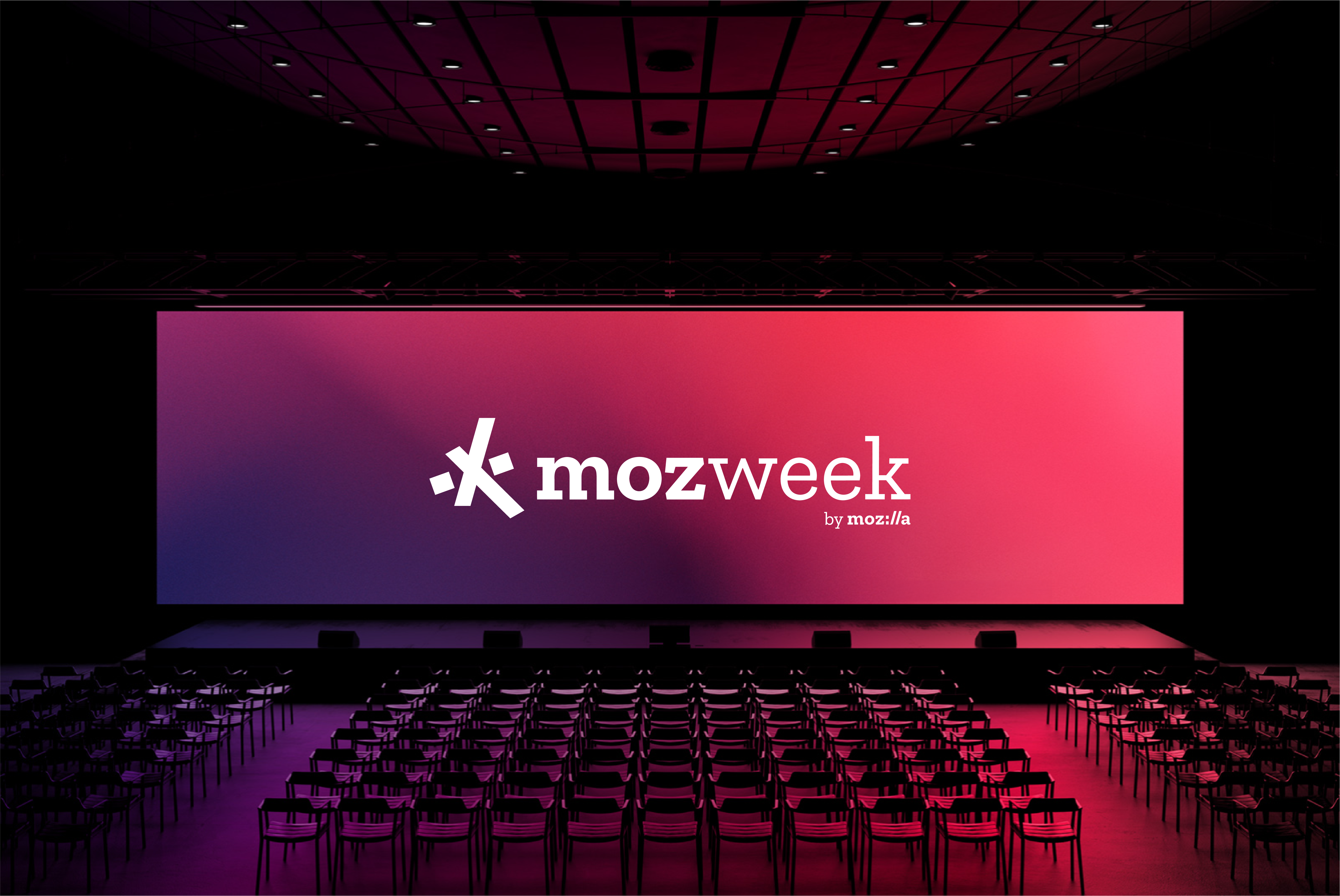
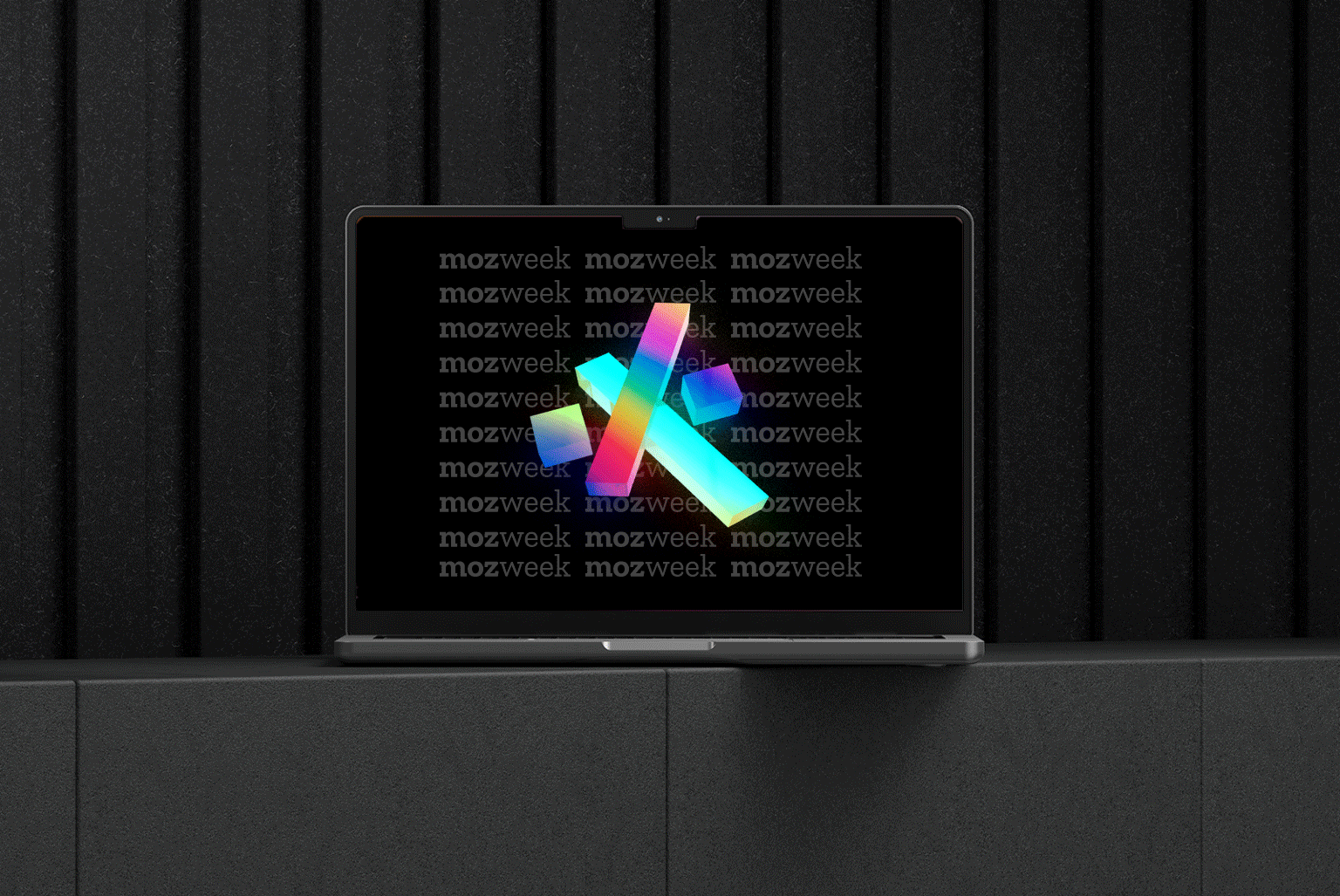
Various touchpoints
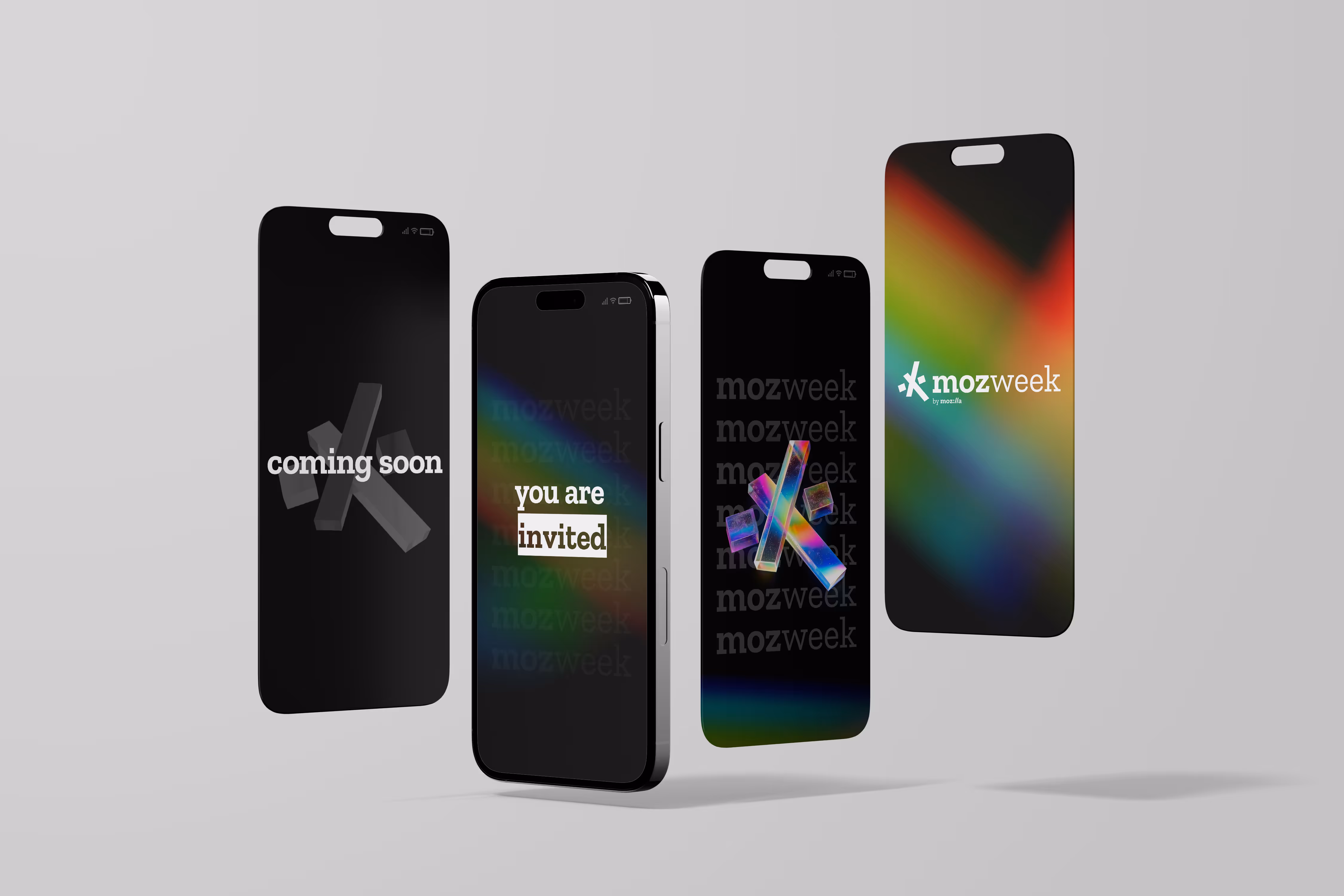
Countdown to event day
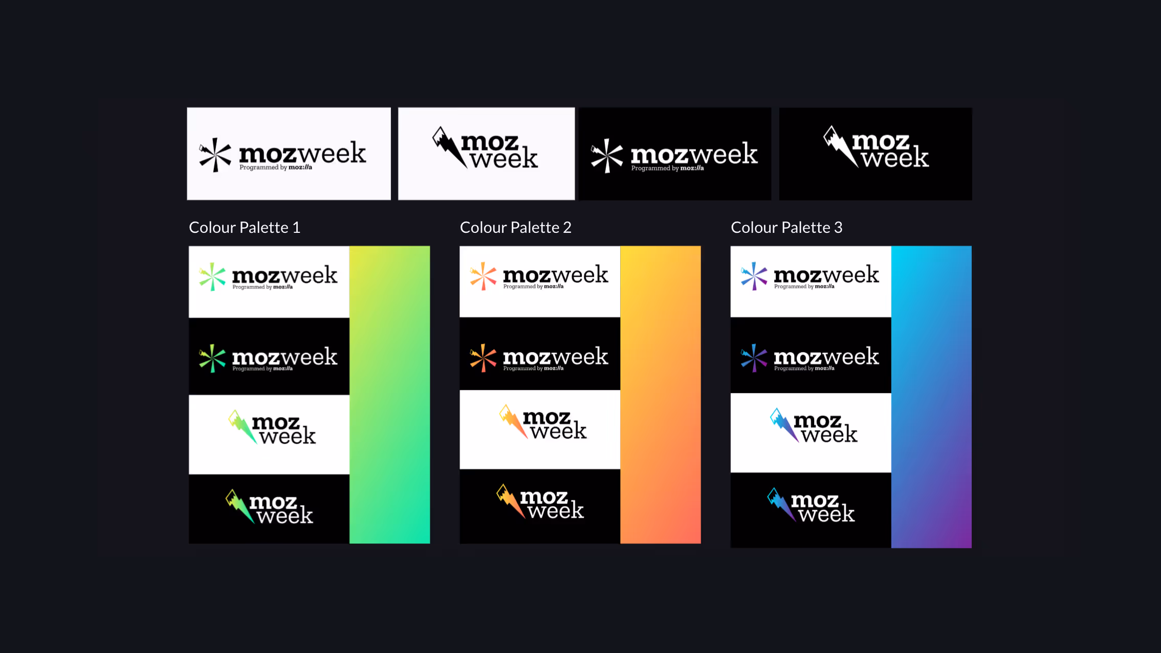
THE COLOUR
Prism was an obvious theme—representing movement, optimism, and shifting perspectives. A burst of energy. A beacon of light.
Prism was an obvious theme—representing movement, optimism, and shifting perspectives. A burst of energy. A beacon of light.
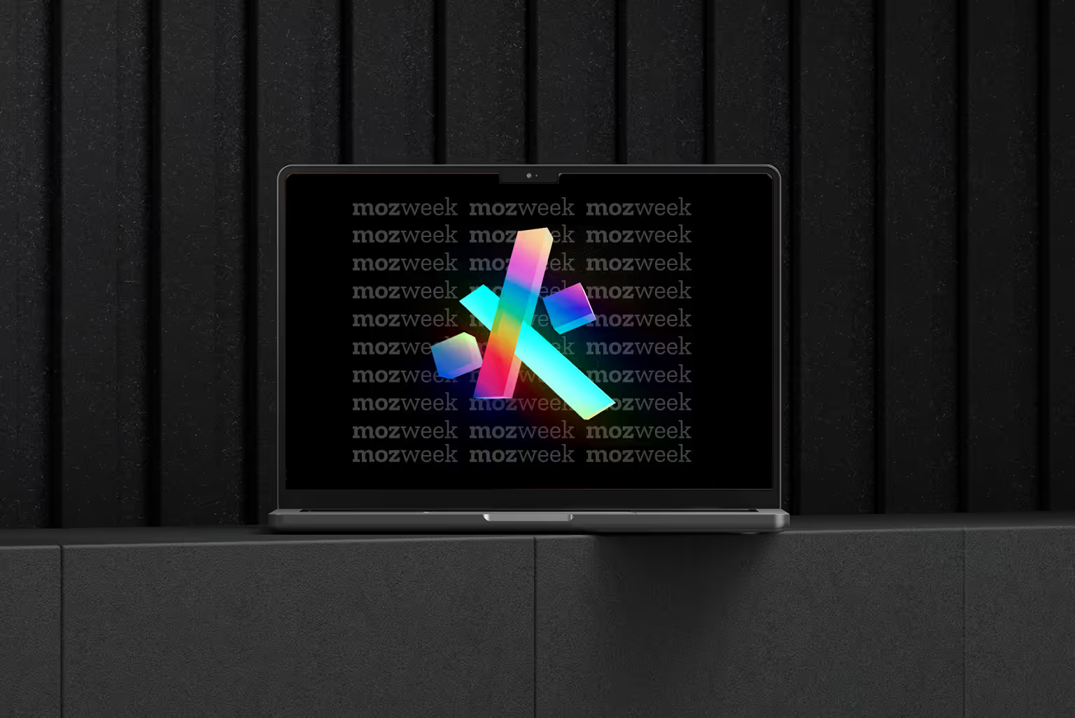
THE MOTION
Individual identity pieces fly in, unite at the centre, then rotate and shine—showing Mozillians shine individually and collectively, celebrating both achievements and togetherness.
Individual identity pieces fly in, unite at the centre, then rotate and shine—showing Mozillians shine individually and collectively, celebrating both achievements and togetherness.
